My 2 cents are not needed here but today's massive correction, which started with a big gap down had turned the mood from euphoric (small caps were outperforming) to panic (all nifty 50 stocks down)!
22 September 2011
21 September 2011
Nifty : Getting FED up!
Nifty has long been in a large trading range, the range though is getting tighter and tighter. Tonight's FED minutes can be a range breaker or can be a non event. Can't say how much of QE3 has been priced in, but surely things will move out of this range in near future.
I have marked the above hourly chart with the 3 trendlines, which I feel will matter most in near term. I have also noted some obvious comments on it. My preferred expectation though is a break out above 5170, trapping bulls who would be playing for 5300 and a sudden reversal back into the trading range, most probably going all the way to 4900.
I have marked the above hourly chart with the 3 trendlines, which I feel will matter most in near term. I have also noted some obvious comments on it. My preferred expectation though is a break out above 5170, trapping bulls who would be playing for 5300 and a sudden reversal back into the trading range, most probably going all the way to 4900.
Nifty : Window Dressing?
The recent rally in Nifty, especially after today's 100+ point gain is making a lot of eyebrows raised amongst the Technical and Market Internal watchers. Apart from low volume, we can also see extremely low institutional interests in cash market. Many of them are pointing to the fact that September end is also a quarter end and hence a lot of "Window dressing" is going on by the fund managers.
If they are reporting equities they hold and their current prices and if I see a lot of losses in my opted fund, chances are much higher that I may pull out of it. This is what most retail investors do. So just to hide some of the pain, most of the fund managers buy (with low conviction and mainly to report better average prices) and hence create a rally during quarter ends.
I am not saying that all rallies during these time periods are due to this fund manager gimmick, they can be genuine buying or just an oversold counter trend rally caused by short covering. But the table below will certainly beg for reasons why quarter end months tend to be good for equities.
I have pulled Nifty monthly returns (approximate) of these months since 2007, I have also noted the returns from the previous month. The highlight is green if the quarter end had positive return and the month earlier was negative, yellow if both were positive and red if quarter end was negative.
As you can see, out of the 4 occurrences of a negative return 3 were in 2008 (a year which most of the fund managers would like to forget) and another in June 2009, after a 27% rally the month before it hardly mattered what prices they were showing.
In a sample of 18 months 14 are showing positive returns (78%), whereas during the same period (when we consider all months and not just quarter ends) out of 56 months 32 show positive returns (57%), certainly a significant difference to be considered random.
So is the current rally another artificial propping, if yes then we can surely see this money going off the table pretty soon.
20 September 2011
What does a chart pattern really mean…
Nifty has not been moving a great deal, looks like 5150 to 4900 is the trading range it is finding some comfort in. I too have not been able to do a lot of study. To be honest, it is very difficult trading environment out there, with lots of news flow. In the mean time came across another gem from Peter Brandt. Please go through it, Peter has poured his heart out, regarding Charting.
What does a chart pattern really mean…
- Posted by PeterLBrandt
- on September 19th, 2011
…and how and why I changed my mind on Sugar.
Blogging during the past several months has driven home one huge lesson – many, many, many self-professed “chartists” do not have the first clue about the purpose of charting and charts.
Some of these same people frequently tweet about charts. Yet, they appear to be clueless. Frankly, I think it is an ego thing. They self-deceive themselves into thinking they get to create their own theories of charting and they have no interest in seeking out the wisdom of the early pioneers of classical charting principles (Schabacker, Edwards, Magee, others).
So, they make stuff up as they go, using their own opinions as the litmus test for truth. These folks will always be around – but over time the exact names will change, because each group of these ego-driven “traders” will leave the arena with their pockets turned inside out. I will make one more comment on this subject later in this posting.
So, exactly what purpose do charts actually serve
Charts are a record of where prices have been. At any given time a chart reflects the opinions of all market participants who have acted upon their opinions by buying or selling commodity contracts, foreign exchange pairs, stocks, ETFs, debt instruments, etc. Charts are maps of where markets have been. Over time a bar chart reflecting this buying and sell may form a recognizable geometric configuration. These geometric patterns can be useful for trading … to a point.
A chart is NOT predictive. Some people believe that if they could only study a chart hard enough, and in the right way, they would be able to determine what a market will do. NOT! I do not want you to miss this next point: Charts do not provide a prediction, they provide a possibility! Sorry, but that is the function of a chart.
A chart provides a trader with an edge. Exploiting an edge is how a trader makes money. I am attracted to classical charting for two reasons. Chart patterns:
- Provide me with clue for what is possible
- Offer – at least some times – an opportunity to construct an enormously asymmetrical reward to risk trading event
Technical analysis, including chart analysis, has earned voodoo reputation. It deserves this reputation. The reason is that technical analysts go on record with market predictions based on their analysis. Most of these market predictions are wrong. Of course, sometimes the predictions are wrong because patterns fail. Sometimes they are wrong because the chart misreads his or her chart. Now fundamental analysts are wrong just as often, but their methods do not earn voodoo status – this is a subject for another day.
There are five primary things you need to understand about charting.
- Most chart formations fail and morph into other patterns, which in turn fail and morph again.
- Charting cannot be used to understand a given market all the time.
- Major moves can occur without any clue from the charts.
- Charts are not predictive. They are a map of where markets have been, not a map of where they are going.
- Charts are a trading tool – and when used as a trading tool charts serve a wonderful purpose.
There are times when a chart morphs, morphs, morphs and keeps on morphing until a huge, no-question-about it pattern emerges. Then I get excited. It is at this point when the outcome of a market becomes a real possibility (not predictive). And it is at then point when I develop a “Strong Opinion, Weakly Held” (see post on this concept here).
When a chart pattern provides a real possibility along with a set up consistent with an overwhelmingly favorable reward to risk profile, then I become really interested.
With this discussion in place, let me transition to the current chart of Sugar.
Sugar — Yes, I changed my mind
I have had a strong opinion (weakly held) on the Sugar market. This opinion is based on the longest-term charts (not shown) which indicate the possibility for Sugar to trade at 70 cents. Thus, I have been interpreting the daily charts through the lens of this bias.
I believe that a bias can be very good thing for a discretionary trader because if the bias enables an unusually aggressive trading posture at the right time, huge profits can be made. If someone is against the concept of having a bias, then they should develop a systematic approach and dump the discretionary method.
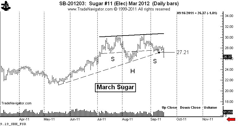
Consistent with my predisposition, I saw the possibility that the daily chart was forming a continuation H&S pattern (or a cup and handle for you snooty tea drinkers). This pattern was forming in such a way that the right shoulder had balance with the left shoulder and also support from a 4-month trendline.
As a trader, the charts showed the possibility and offered an insane asymmetrical reward to risk profile. My strategy was simple.
- Buy a layer of longs near the possible right shoulder low, initially protecting the trade below the August 17 low.
- Add a layer if the market could get above 28.61.
- Add another layer if the market could complete the continuation H&S.
Thus, I had the possibility of establishing long three contracts for each $100,000 of capital. The maximum risk was 80 basis points (4/5th of one percent of capital, or $800 per $100,000). My potential gain per $100,000 if the continuation H&S was the slingshot to 60 cents would have been $104,160 – a possible reward to risk ratio of 130 to 1.
So what were the odds the possibility would become a reality? Maybe one in 20, one in 10, or one in five at the most! I would have been crazy had I not played the Sugar market the way I played it. I would be equally crazy if I continued to insist upon the bullish play when the chart started to tell me something else.
Let me interject one thing into this conversation. A chartist needs to have patience and discipline to be sure, but there is one other thing required to take advantage of the big moves. That is creative imagination. It takes imagination to talk about 60 to 70 cent Sugar when prices are below 30 cents. But, it took imagination back in 1982 to talk about Dow 1,800 when the Dow had never traded above 1,100 in its history. It took imagination in 2007 to talk about 60 cent Soybean Oil when prices were at 37 cents. It took imagination to think Copper would trade at $3.00 when it crossed $1.60 for the first time in history in 2005.
Please connect with what I am saying here – using imagination to think about the possibility of a chart is NOT the same thing as making a prediction or forecast. Charts are NOT predictive.
When I introduce a new major chart development into this blog, I am introducing a new possibility, not a prediction. If you have a problem with the fact that charts are useful to present possibilities, not predictions or forecasts, then I will strongly suggest that you will walk away from your experience trading charts with less money than your currently have.
Back to Sugar – it all changed on Friday. Trading a chart possibility involves creating a scenario on how prices will play out. The scenario never plays out exactly how I imagine, but there have been times when it has been pretty close. Importantly, market action can be such that the possibility is completely nullified.
The decline on Friday carried prices below the existing right shoulder low from September 12 at 27.21 and penetrated the 4-month trendline. The possible price scenario I had been operating under was negated.
Let me share a secret about charting (as if there really are any secrets). Eighty percent of the time when a chart sets up to offer a strong buy signal, inherent in the same chart will be a strong sell signal. In fact, if a chart pattern you are watching does not provide both, then you are well advised to question your interpretation.
The decline below 27.21 on Friday was a strong signal for me to short Sugar. I did do some shorting, but not nearly enough because it is sometimes difficult for me to switch my mind so quickly from one scenario to the opposite read. Yet, my experience is that if I am strongly biased in one direction, a chart signal in the opposite direction has a strong probability of working.
So, I am short Sugar. The market has a pretty good chance of testing the July low. If the market can close decisively under 25 cents, then we have a double top with a target of the May low at 21 cents.
Some concluding comments
You need to know that 90 percent of the content on the internet is garbage. You need to be prudent and wise consumers of internet trading content. Advice is cheap and way too plentiful. Guard your mind as you guard your trading capital. Choose well who you listen to. There are many wolves dressed as sheep in the trading industry. By the way, the StockTwits blogging community represents some of the best minds on the internet.
10 September 2011
Will Dollar Force More Correction?
Dollar Index chart above shows that dollar has freed itself on the upside after a multi-month consolidation. Dollar Index is majorly weighted against Euro and all of us know what fate is Euro having these days. Atleast dollar is not fighting for its survival. I will not go into details of currency wars that is happening, but looking at the chart gives a feel that Euro is going to be serious trouble.
$USD has broken out from range, broken above 200 Day moving average and is also trading above the Ichimoku clouds. So we have enough reasons to be bullish on Dollar, the next resistance is 200 week moving average at 78.75 and weekly Ichimoku cloud around 80. I am expecting all these to be cleared after some amount of consolidation around 78-80.
The bullish moves of dollar though not necessarily is negative equities, but the reason dollar is making such moves is negative for equities. Investors are fearing Euro and Euro assets, either they expect Euro printers to run full time or they fear some kind of Euro structuring which will deal with Greece and maybe some more defaults. Whatever be the case, there is hardly any reason to be a stock market buyer!
FII Futures Interest
The folks at Vtrender do a lot of good F&O data analysis. I have "stolen" some data from them, did some tweaking to produce the above chart.
It shows FII Nifty Futures Open Interest. The Blue bars are Nifty change per day and the Red and Green lines are cumulative Short and Long Open Interest.
What we see is that after 29th and 30th August when Nifty moved from 4750 to 5000 causing a lot of Shorts to run for cover, Shorts are only getting added. Longs got into the system since the start of series, but is now looking on weak footing.
Interesting to note is that from 6th to 8th September, Nifty rallied around 150 points and the amount of Long added is 14k contracts while shorts got added to the tune of 50k contracts! Friday saw a good amount of long covering and short addition. Did Friday marked the turn of events? Other unknown factor here is how much rollover of Shorts and Longs happened into this series from August.
Tracking FII money flow (more so in Derivatives) gives us a good overall picture of Markets in near term. But at Inflection points where huge long term money gets in or out of the Market, these analysis can and will seem futile.
Another thing which I feel everyone should keep in mind is that, FIIs are not a single body. I bet most of the big players would not be even knowing about some small players existence. They are not with a single opinion about the market. They do not conference before the Market open to decide what their strategy should be for the day. I am sure, at times there must be polar differences in their opinions and their actions, there must be Bulls and there must be Bears. You never know, which deep pocket FII gets freaked out due to Greece Default Fears or who suddenly pulls all his money from China to put it in India!
08 September 2011
06 September 2011
Peter Brandt : At His Best !
The History of Unfilled Gaps in the U.S. Stock Indexes
- Posted by PeterLBrandt
- on September 5th, 2011
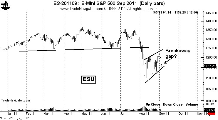
There is a chance – a very good chance based on late Sunday and early Monday trading – that a down gap could occur on the daily and weekly U.S. stock index charts when they officially open on Tuesday morning.
If a down gap occurs, it could prove to be an historic breakaway gap that might not be covered for months (or even years). Such a gap would leave stock market bulls stranded.
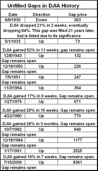
Uncovered gaps in broad indexes such as the DJIA are EXTREMELY rare. In fact, (by my count) over the past 80-plus years there are only 11 uncovered gaps in the DJIA. Reflecting the historical growth of the equity market, 100% of these have been up gaps. Not a single uncovered down gap exists. [Note: A down gap on June 9, 1930 resulted in an 84% decline and remained uncovered for 21 years.]
A tabular listing of the uncovered closes in the DJIA follows.
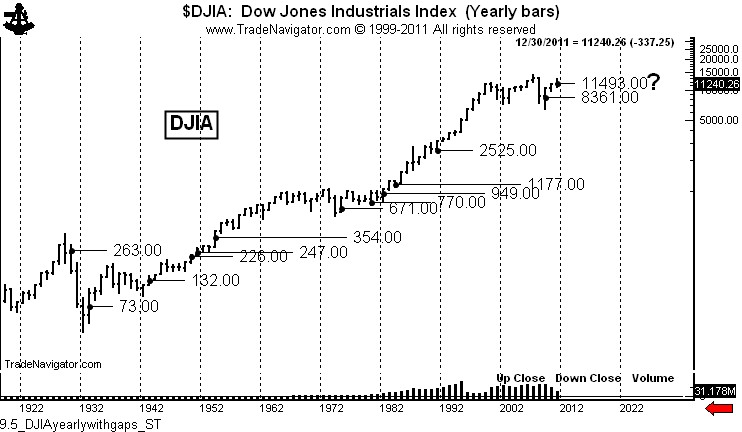
It is imperative to note that these 11 gaps appeared at crucial points throughout the years, as shown on the yearly chart below.
A price gap is when the high of one day is lower then the low of the next day (up gap) or the low of one day is higher than the high of the next day (down gap). Gaps do not need to be large and gaping to count.
Technically, there are four different types of price gaps.
An area gap is the common type. These gaps occur frequently within a broad price range and are typically filled within days or weeks, although in some cases an area gap may not be filled for months.
A breakaway gap occurs in the very early stages of a major price trend. These gaps are initially interpreted as area gaps. Only after a sustained trend does a chartist recognize the breakaway gap for what it was. Tuesday’s upcoming down gap (if it occurs) could be a breakaway gap.
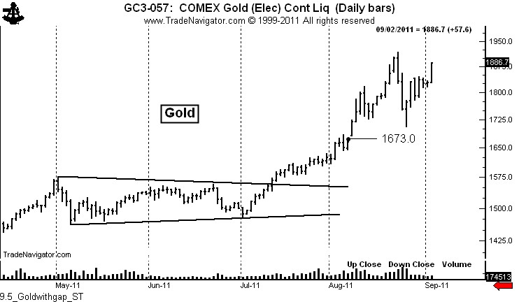
Measuring gaps occur during approximately the half-way mark of a strong price move. Measuring gaps are also referred to as “half-way” gaps. A recent example of a measuring gap occurred in Gold on August 8. I posted a blog about this gap on August 10, titled, “Want to know what gold is going to do – the key is the August 8 gap.”
I pointed out in the post that the gap projected Gold prices to 1872. Gold was at 1730 at the time of the post.
Finally, exhaustion gaps occur very late in a trend. When they are filled it is a sign the trend has run its course and chartists should look for confirming signs of a trend change.
As a basic rule, gaps of all types are more frequent in individual stocks and commodities than in broad averages. Thinly traded stocks and deferred futures contracts especially are loaded with gaps to the point that gaps are meaningless. Chartists should only pay attention to gaps in broad indexes and the most widely traded stocks, commodities and forex pairs.
Are there any reasons to believe that a downward gap in the major indexes on Tuesday could be a breakaway gap? You betcha! Consider the following:
All of the broad stock indexes have a H&S top in place. I cannot believe how other traders are pooh-poohing this top. Tops like this come around only a few times in the entire career of a trader. Yet, everyday I read or hear about another “chartist” playing for a bounce. I find this to be just unbelievable. It is a sign of the extreme short-term nature of the markets when “chartists” pay more attention to 10-day RSIs than to a 6-month H&S top.
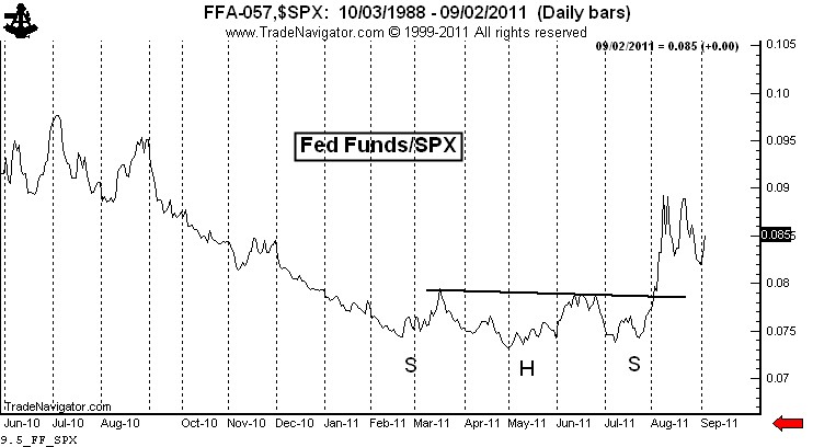
One reason for the skepticism about the current bear market is the natural bias of most traders toward the long side of things. Many traders doubt the H&S top in the stock indexes. Yet, the same traders would be bullish about the chart below. This chart is an inversion of the S&Ps (actually, it plots the Fed Funds rate divided by the S&Ps – close enough). If as a trader you would be bullish on the chart below, then you MUST be bearish on the stock market.
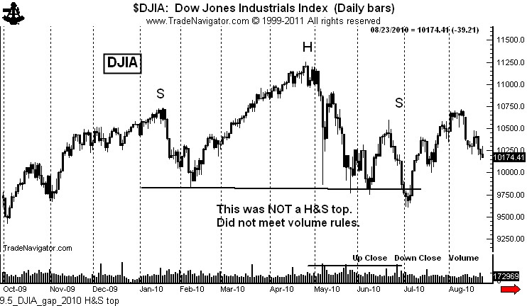
Another reason I hear for the skepticism of this current H&S top is that a similar H&S top in the indexes failed in 2010. Not the same, folks! The H&S top in 2010 did NOT meet the volume requirements of a H&S pattern specified by Schabacker, Edwards and Magee. The “H&S” top in 2010 was not a H&S that failed – it never was a legitimate H&S pattern.
Note on the chart above how the 2010 pattern had the heaviest volume in the right shoulder. This disqualified the 2010 configuration as a H&S pattern. Sorry, Charlie! Chart patterns have rules that must be followed. I continue to be flabbergasted at various formations identified by “chartists” that don’t come close to meeting the requirements of the patterns at issue. Folks, the Edwards and Magee book is considered to the bible of charting for a purpose. Read it. Study it. Learn it.
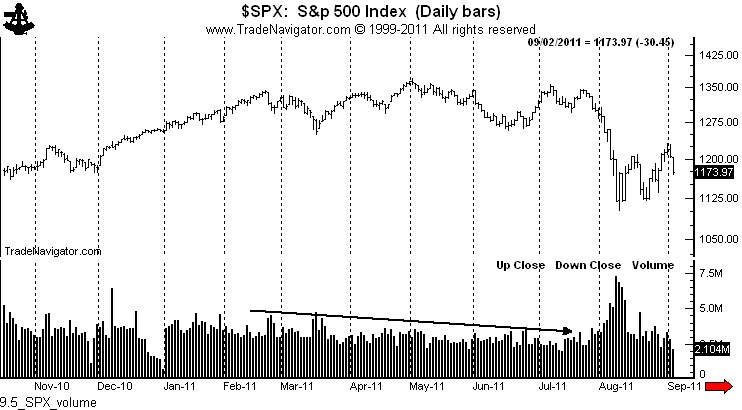
In contrast, as shown below by the chart of SPX, the volume profile of the recent H&S pattern was textbook perfect, heaviest in the left shoulder and head, lightest in the right shoulder. The fact that volume expanded at the breakout only further solidifies the H&S interpretation.
By the way, note the huge volume expansion on the chart above in August. Huge volume is either starting volume or stopping volume. My bet is that this is supply entering the market — and that is not bullish.
A second reason to expect a down gap on Tuesday is the 4-week flag that characterizes all of the major indexes. The declines on Thursday and Friday indicate that the flag is ready to be completed.
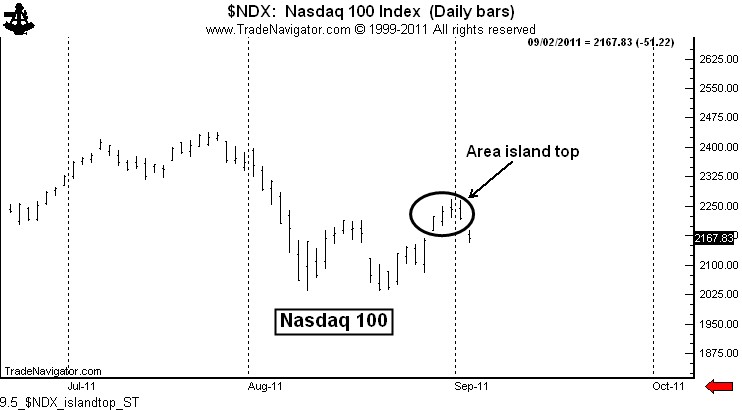
A third reason to expect a down gap on Tuesday in the major indexes is the fact that the spot Nasdaq 100 Index completed a 4-day area island top on Friday. Island tops, if not filled within days, can be extremely powerful indications of a pending price thrust.
What would be the practical and tactical implications of a down gap in the stock market? Quite simply, a risk that the gap is not quickly filled would represent an asymmetrical reward to risk profileof incredible magnitude.
Friday’s low in the DJIA was 11,211.35, closing at 11,240.26. As I write this post on Monday AM (3:34 MST) Dow futures are trading 97 points lower. If things do not change (and they could), the spot Dow would gap down to 11,140, a gap of 70 Dow points.
Many traders play a game of “fading” opening price gaps. If a gap occurs, these traders will go long, expecting the gap to be closed. Talk about playing with fire! These traders will, no doubt, be comforted by the release late week of the CFTC Commitment of Data Reports, showing that commercials have been huge buyers during recent weakness. In fact, commercials have not been as long since ….. May 2008 (wow, that is comforting). If the market gaps down on Tuesday and IF the flag is completed next week, I would define the huge commercial long interest in this way: “Holy capitulation, Batman.”
Let me close this post with a few words to the growing choir of my critics. In the “good olde days” at the Chicago Board of Trade, upstart traders needed to prove themselves before talking smack. How things have changed! Now all a newbee needs is an internet connection, one or two good trades (or success with a paper-trading account), an opinion and a big ego.
First, I am not doom and gloom on the stock market. I could care less whether the market goes up or down. In fact, the most profitable single trade in my career was on the long side of the stock indexes. I have a sentimental connection to a bull market in stocks.
I do care if I am on the right side of whatever direction the market goes. My comments on the stock market have been limited to accepted classical charting principles and price goals. I have not editorialized on the state of the economy or anything of the like. The charts are what they are – and until they change I will continue to shout “look out below” from the highest roof top I can find (like the rooftop in my “dead cat bounce” cartoon).
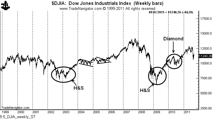
Every major advance in the DJIA in the past decade has been ushered in by a classical chart pattern, as shown below. There is no basis in classical charting to call for a bull move in the stock market presently. There could be in the future – but there is nothing on the weekly chart to launch a bull move
Second, whenever I make a comment on a POSSIBLE chart pattern that fails to materialize, the children’s choir is quick to point out that I am “wrong.”
Three things need to be understood about classical charting principles (read carefully, kids):
- Charts are constantly morphing as one pattern fails and turns into something bigger and different.
- The development of chart structures is an organic process. A chart (especially an intraday or daily chart) may lean toward an interpretation one day and another interpretation a few days later.
- Classical charting principles cannot be used to define all the market all the time. Massive moves can occur without any clue from the charts.
I am much more interested in being profitable than in being right. Believe me, as a trader since 1981 I have eaten more humble pie than you can imagine. I have very little ego need to be right in a market prediction. But, let me add that I don’t think I am wrong on my analysis of the stock index charts. We are in a bear market. Whenever the market rallies I believe it is winking at you.
One of the choir boys made a major fuss last week that my initial prediction for a bear market correction in the form of a rising wedge was incorrect – that a flag would have been a better call. Get a life!. I am continually amazed at all the faux technicians out there that have not figured out the difference between a market analysis and opinion on one hand and risk-controlled trading operations on the other hand.
Another one of the young male sopranos took exception to a statement I made that the U.S.stock market has done nothing for 10 years – he claimed I was wrong because some tech and mineral stocks have skyrocketed. Again, get a life.
So, now at 4:05 AM, here is where we are:
The Sept. S&Ps have gapped lower. If this gap holds, it will be a weekly gap. If daily gaps are potentially important, weekly gaps are history if they remain unfilled.
A bear flag is pending – of course, a bear flag is NOT a bear flag until it is completed, does not fail, and then runs to its target.


