30 March 2011

Nifty : Options Galore

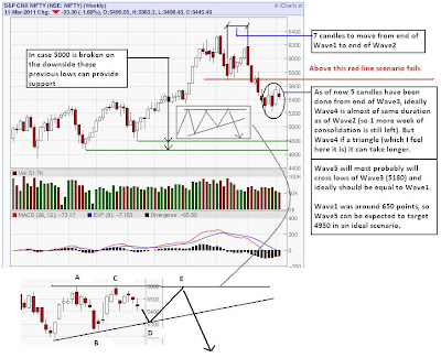
Now that our preferred wave count has been violated, as the current up-move has gone past 5690, the possibility of this being a wave 4 no longer exists. So how do we adjust to the new possibilities that has open up.

When a downswing ends in 3 waves, the most obvious (and most bullish) next phase that comes in mind is a 5 wave up impulse. Though I cannot totally rule out a 5 wave impulsive move up from 5180, the possibility of it is very low. The reason being the movement looks very corrective in nature. (Details later)

The next probability what we can think of is, that the current leg up is wave 2 of 3, that is wave 3 is sub dividing here and if correct it would be the most bearish count one can think of.

The other possibility can be, that the current wave is a corrective wave in an overall corrective pattern. Mostly wave B of ABC (A in 3 waves, B in 3 waves and C in 5 waves) or wave X of a double zig zag (ABC-X-ABC).

So we see that, there are numerous routes that Nifty can take from here, once the simplest count got violated. We need to see more aspects (Volume, MACD etc) to triangulate the next most likely path.

Just something to ponder over:

27 March 2011

Max Pain : March Series

Options Data as on Friday End is suggesting an expiry between 5550-5600.


26 March 2011

Nifty : Breakout or Bull Trap?

Nifty has broke out of 5600 resistance on Friday and closed at 5654 with high of 5667. Volume was not convincing and it looked more of short covering than long formation. Rallies generally start with short covering, so that is acceptable. So should we take the rally as a break out? As you can see on the chart below, the 5600 horizontal line was taken out yesterday. If you see the intra day chart (not shown) you will see how once 5600 got broken there was a straight line of buying, which shows 5600 was a tough challenge and in the minds of many players.


What is also interesting to see is that, though the Nifty has cleared 5600, there are other tougher challenges.
First that I want to point is the channel's upper trendline, which it touched on Friday.
200DMA is at 5688 just 30 odd point higher from yesterday's closing.
I have shown Keltner Channel (green line band), for which the upper band is at 5675.
Apart from that Nifty had taken support at 5690, while correcting, so that can act as resistance.

So we see that things will not be easy for Nifty going forward, unless this is a genuine breakout and higher volumes are seen in coming days. If this is not a break out but rather is a bull trap, then we can see Nifty falling below 5600 very soon. Chances of a trend emerging is very high from now onwards. Either we are going to see upper resistances cleared and a strong rally to 5800-6000 or a rapid fall back to 5350-5400. The next week being expiry will make things even more volatile and looks like there is going to be blood on the street, either of bulls or bears.

24 March 2011

VIX : "Vapour UP"


23 March 2011

Nifty : Volume and Speed Analysis

Many of us would be quite frustrated and confused with why Nifty is behaving the way it is. It has done almost nothing if looked over a month's period. Even the volume is abysmal and looks like no one is interested in buying or selling anything related to stocks.

Local events like RBI policy and budget (THE trend setting event) for Indian markets have come and gone. Nifty reacted for a day and then again lazed around. Global events like the devastating earthquake, tsunami and nuclear dangers, war like situation in Libya and other middle east countries also looks like little worries.

So what will move the market, if not such news. As many Technical Analysts say its not the news that drive the markets its the mood of traders that do. As of now traders are not in any mood to do business. Most of them are waiting for some trend to emerge so that they can take positions according to it. Others are getting whipsawed both sides.


Above table shows the closing price of Nifty, and the major turning points, along with volumes.
As you can see wave1 was sharpest of all and also had the highest volume. Wave2 had very low volumes. Wave3 was longest in terms of price as well as time and also had quite high volume. The current wave, wave4 is very flat and has volumes comparable to wave2.

This price and volume action is very much in accordance with Technical Analysis, where trend moves have higher volume and counter-trend lower. For Elliot wave followers as well, this pattern fits pretty well, like lower volumes on bounces, equality of wave2 and wave4 in terms of time. If both of them are combined we can say that the higher probability is of a leg down, rather than up for Nifty.

Coming to the flatness of wave4, we are in a period, where buyers and sellers are at an equilibrium. Market is neither very cheap nor valued enough, for traders to make some easy decision. But someone will give up, either the bulls or the bears and we should she some kind of trend emerge in some time.

20 March 2011

Crude Oil : Parabolic Move Ahead?

With war planes dropping bombs over Libya and their Oil Chief threatening production loss. Crude looks to be in for a Parabolic move. Too bad for equities especially India.


Also to be noted should be the fact that commodities tend to make their final moves in a parabolic fashion. Mostly due to supply fears. Lets see if this is going to be the case.

19 March 2011

Gaps : Read between the Candles

With my little knowledge of Technical Analysis (Price Volume impact on future price expectation), I have come to believe (maybe not as a rule) that Price Gaps are unsustainable.
Gaps are generally observed in spot prices daily chart, where overnight news flow, creates a trading void.

In a bear market we tend to see more gap down days and in a bull market more gap up days. As I said earlier the best thing about gaps are that they are expected to get filled in future course of time. So as an example, if Nifty gaps up 100 points at the open, with yesterday's close 5000 and today's open at 5100, we can expect Nifty to trade back to 5000 in due course of time.

An interesting observation made by chartists around the world is that, a smaller gap tends to get filled in a shorter time period and a bigger gaps are more stubborn and can initially start a larger move in its direction and get filled quite late. I have gone through a lot of charts and even done some analysis on Nifty data and have found this to be quite true. You too can do it to surprise yourself!

A wise action would be to be wary of gap ups from an investment perspective. As gaps are expected to be filled sooner than later, buying for a longer time frame at a gap up would surely result in losses, as price will surely come down to fill the gap (not to mention the time value lost). So the ideal TRADE should be (though there is never an ideal trade), to buy into a large gap and sell into a large gap down, but do the reverse in case of smaller gaps. How to identify what is large and what is small? Well for that you need to be in trading business for atleast few decades!

Just to show an example:


As you see Google came out with great quarterly numbers and the stock zoomed from 540 to 600 on opening, the mood being upbeat it rallied more for few days, but then the inevitable thing started to happen and the gap started getting filled. But hey, not completely. It started rallying again and made a higher high. Also keep checking how the volume changes. Since the 640 high, it has started correcting again and is almost back to the level where it took support earlier. But looks like this attempt to fill the gap would not go waste. This is the most updated chart, so we will have to wait to see if the hypothesis is correct.

So which gap is pending to be filled in Indian markets? The answer is very obvious, Nifty closed on 3672 on May 15th (friday) 2009 and closed on 4323 on May 18th (monday), with almost negligible trading volume. Why so? Well because the UPA has won the election, and it did not needed even the Left front to form a government!


The gap was big, 20%, and the impact was also large, Nifty though fell back close to 3900 it never filled the gap by trading close to 3672. It will be 2 years in 2 months since that event, Nifty is still north of 5000.

How many people believe we may go below 5000, I think a few (that too only after 5500 got broken and is acting as a resistance). How many people believe we may go below 4000, well I dont know any, as of now. Are we going to go below 4000, the chart surely says so.

Gaps are definitely very interesting trading phenomena, and to give you the spunk it has very close relation to human emotions involved in trading.

14 March 2011

Breaking News : Nikkei breaking all Supports


13 March 2011

Expectations for Next Few Weeks


10 March 2011

Nifty : Confused ?

Just a small interesting observation which I wanted to point out.


The above chart shows Nifty confirming two contradictory signals. First is the "Death Cross" which classically is a bearish sign and also of a long term trend reversal. The second is the Ichimoku Cloud "Weak Buy" signal. This could be read more as a signal of downtrend ending and possibility of reversal, as the prices have not yet crossed the cloud resistance.

Moving averages studies state that, in a trend, short term averages often meet long term averages (by consolidating or correcting) to gather energy for the next strong move. Is this "meeting" of 50DMA and 200DMA another such encounter?

Also now that the short term average (blue) of Ichimoku has gone above long term average (red), a decent bout of correction will again send short term below long term which would signal a "Strong Sell" for Nifty.

Which of these is going to happen? Time will tell that. But after a decent consolidation, (may be it will take some more time) prices will break out in some direction. An upward break would certainly suggest this downtrend is over and 6350 high will be taken out in near future. A downward break could be targeting 2009 election gap fill.

09 March 2011

Follow Up : Long over 200DMA & Short below 200DMA

As we saw in last few posts, that over a long term period buying above 200DMA and being in cash or shorting below 200DMA provided excellent returns. But what if we look at these strategies in a shorter time frame? Will they continue to be so?

I am attaching a chart of our best performing strategy of Long above 200DMA and Short below 200DMA for a period of just over 2 years. It starts from 1st day of 2009 when Nifty was just under 3000.


As you can see from the chart our portfolio starts good, but quickly gives up all gains and remain a laggard till May 2010, but catches up with Nifty there, almost tracks it point to point, till Nifty falls back below 200DMA again this year, due to which it eek out some gains. 5870 compared to 5530 is definitely not bad, but it doesn't gives us the "kick" that we were looking for.

So what can we extract out from past few studies. One is that there is no (easy) way you can make "fast money" in the market. Second, even if you are in for long term, discipline is the most important aspect. How simple it would have been to ignore a 200DMA crossover of price in this 20 year period, or how easy it would have been to succumb to the temptation to take out some profit. Looks like investing is very similar to the art of making wine, the longer you wait the better it gets!


08 March 2011

Long over 200DMA & Short below 200DMA

How can I end this series of returns related post by not telling you the best strategy discovered till now! Well obviously it is in hindsight, but just imagine how strong it is by looking the below performance chart compared to buy and hold. This trading idea is to Long Nifty over 200DMA and Short Nifty below 200DMA.


The CAGR here is 46%, with which I feel even the smartest fund manager would be jealous of. I am sure this will make you feel jittery. And I would slice this strategy's performance more so that we can see exactly where it fails and what is its strength.

The easiest thing to point out about its performance is the fact that is over a very long period, another that it gets the benefit to ride the biggest bull run Indian market has seen from 2003 to 2007. But also see its performance from 1992 to 2003, where Nifty actually has gone nowhere, maybe did some sharp rallies and then fell back, but the return during that period is no less.

While you digest this shocker, I need to check out where can this fail.

06 March 2011

Returns from Golden and Death Cross

As per previous post lets check out how "golden cross" would have performed on Nifty in last 20 years.


As you can see, the strategy to "long" Nifty on golden cross and getting out of Nifty and being in cash on death cross has underperformed buy and hold strategy.

But what if we tweak this idea so that we benefit in the downtrend as well. So the plan would be to "long" Nifty on golden cross and "short" Nifty on death cross.


Well, this has certainly not worked either! This strategy has actually been even worse.

So, why did this happen? We were expecting that following golden and death cross would be a wiser decision than just hopping in and out of nifty around 200dma. And we also added an aspect of shorting the Nifty to get returns in downtrend.

The easiest thing to point out would be the fact that crossovers are slow to happen. Nifty made its "Top" in November at 6340 and had a fast fall to 5180. The death cross is happening in March at 5530. 4 months and 800 points later. A sign that its slowness can do some damage for returns based on it, though this crossover signals a mature trend, but thats a different issue.

Strategy 1 here fails when compared to buy and hold because the wait to get "Long" when an uptrend starts and the wait to get out when downtrend starts is far too much. It eats away substantial profits. Also, at times, and I will say generally the reversals are swift and most of the gains can come quite early.

Strategy 2 fails and fails more so because of the double whammy of the reason stated above.

To wind up, I would say that it all depends on how agile your trading strategy is and what is your time frame. People would have had great returns from ordinary strategy and poor returns from "proven" strategies.

05 March 2011

To "Buy and Hold" or Not

After my previous post, I was inclined towards quantifying returns from some simple strategies like buy and hold, buy above 200 day moving average and be in cash when price is below it and that of golden and death cross etc. These strategies can get complex if we also add an option to short the market when its weak or the option to be in fixed income when in cash. It could get even more complex when we try to have an asset allocator to move into fixed income, equities and safe havens like gold! Anyway I think we can dwell into those only when we get over with the simplest ones.

So let me compare the two simplest strategies available "buy and hold" and "buy above 200 day moving average and be in cash when price is below it". Here time is an important factor and as you know the power of compounding can do miracles in long term, though then we have to price in Inflation, which certainly is a headache for long term investors.


As the above chart shows, we are tracking these two strategies since mid july 1991, which is almost full 20 years. Long enough for people to retire, kids to grow up and housing loan EMIs to get over! So what do we see, we see that in 20 years buy and hold has done quite good (13.6% compounded annually) , but when you compare it against the other strategy it is dwarfed (28.7%)!! No wonder people are and should be scared when price is below 200 day moving average.

(I think long term fixed income rate would be around 8% and inflation rate to be around the same levels).

This study also shows that even the smallest of interference with the investment idea can actually improve it in long term!

Next we will try to quantify returns of a golden cross, any guesses if it can beat our simple strategy!!

Nifty : Death Cross?

There is a conventional knowledge of "golden cross" and "death cross" in technical analysis using moving averages. For starters a golden cross occurs when 50day moving average overtakes 200day moving average from below after a considerable rally from lows and a death cross occurs when 50day moving average overtakes the 200day from above.


The reason I am doing this post is because of Friday's action Nifty has done this "death cross", last one occurred in early 2008! As the chart above describes this crossovers from 1991, you see that since 2004 this is the 4th such event (including golden cross). Each time the effect has been significant.

So what should we infer from these numbers. What I feel is that there was no strong trend in the market before the 2004 crossover and Nifty just consolidated where up moves and down moves cancelled each other. It was a time of accumulation and base formation and as these should, took a lot of time. The period of 2004 to 2008 was the period where breakout and momentum was in play and the period when chasing momentum really made sense.

What I feel is that though there is no holy grail of trading and investing, this rule is still followed by a large herd of investors. Just because of its simplicity and significant ROI. Not only does this method identifies an entry point it also tells you a time to exit. And know what, it has signaled a time to exit for long term investors!